Pages

Showing posts with label mapoftheweek. Show all posts

Monday, August 16, 2010

Pneumatique


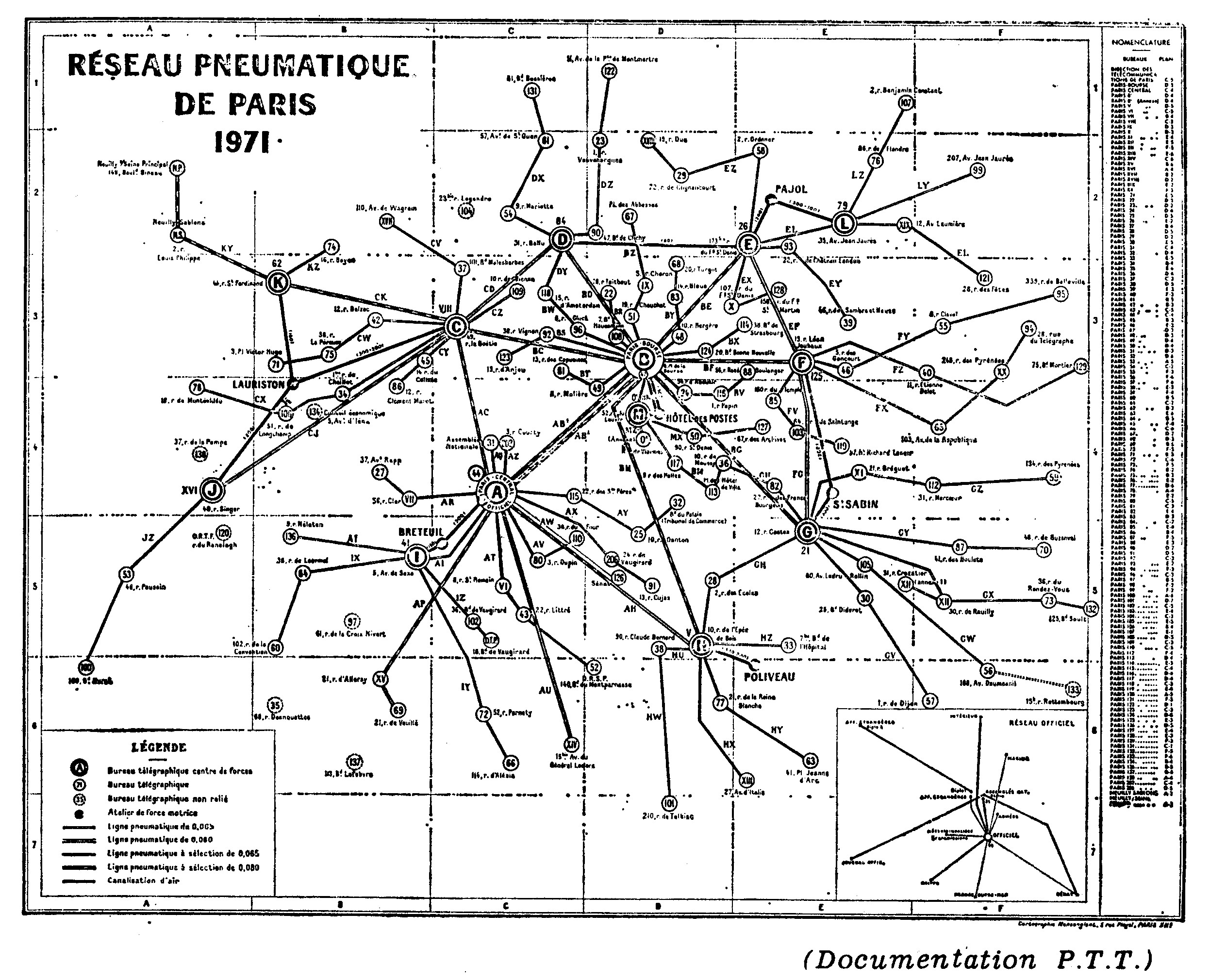
:: Paris, image source
Pneumatic post or pneumatic mail is a system to deliver letters through pressurized air tubes. It was invented by the Scottish engineer William Murdoch in the 1800s and was later developed by the London Pneumatic Dispatch Company. Pneumatic post systems were used in several large cities starting in the second half of the 19th century (including an 1866 London system powerful and large enough to transport humans during trial runs - though not intended for the purpose), but were largely abandoned during the 20th century.Recently I came across this interesting text on the pneumatic post in Paris. A major network of tubes was in use until 1984, when it was finally abandoned in favor of computers and fax machines. This invisible network under the city is highly fascinating in terms of its size and capacity. For example in Paris the peak was in 1945 where 11.271.228 deliveries were sent through the 467 km long tube system. :: Rohpost Berlin 1885, image source
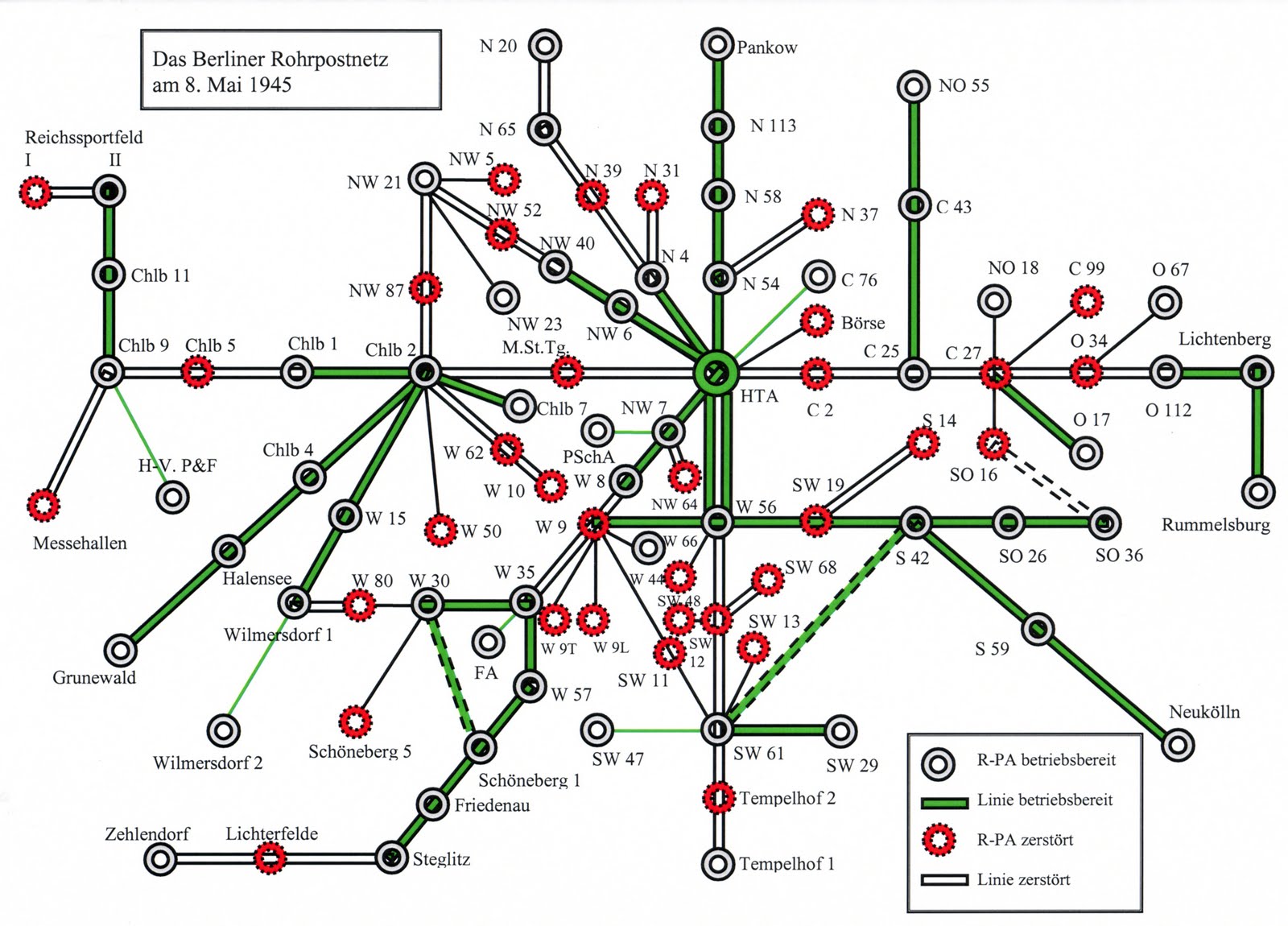
:: Damages on Berlin's pneumatic post after WW II, image source
Also Berlin sustained a pneumatic system called 'Rohrpost' of 400 km until the years 1963 (West) and 1976(East).Link:: Prague, image source
In Prague, in the Czech Republic, a network of tubes extending approximately 60 kilometres in length still exists for delivering mail and parcels. Following the 2002 European floods, the Prague system sustained damage, and operation was mothballed indefinitely.:: New York City's pneumatic subway in 1870, image source
New York City even had a pneumatic subway in the 1870s. Over 400,000 New Yorkers took a joy ride underground during the three years the pneumatic subway was open for demonstration. In 1873 , a stock market crashed killed financial support and thus the extension of the pneumatic subway.


Tuesday, August 25, 2009

Thursday, June 4, 2009

! MAP THIS ! #15 TIME-LAPSE VIDEOS OF MASSIVE CHANGE ON EARTH

Wired Science recently posted a series of time-lapse videos on:

the Urbanization of Dubai:


Sucking Out The Aral Sea:


or Clearing the Amazon

Over the past decade, the number of people on Earth shot up by more than 13 percent, to nearly 6.8 billion people. To make room for all the hungry, breeding, CO2-emitting bodies on our small planet, we’ve ravaged Earth’s surface with staggering feats of deforestation, irrigation and urbanization — and NASA satellites have captured it all. The videos shown above (and a few more on Wired) are compiled from images posted on NASA’s Earth Observatory, of some of the most impressive conquests of man over environment.

Saturday, January 24, 2009

! MAP THIS ! #14 COMPLEXCITY

The Complexcity project explores major cities around the world focussing on how their urban sprawls have evolved over time. Using the patterns formed by roads in each city, Korean born designer Lee Jang Sub creates complex graphic configurations, combining the idea of natural and man made systems. In the process he finds a concealed aesthetic within the convoluted pattern of urban networks. He started with his hometown Seoul, and has already completed Paris, Rome, and Moscow.

Through this work, I would like to suggest they don't see the complexity of a city only as an object that should be neatly arranged. Instead I propose a new approach of finding order in the ComplexCity, Seoul.

Each one of branches in a big tree seems to be disorderly spreaded with no rules, but when you see the whole tree, you can find it is in perfect harmony. Nature has a balance which we cannot see with our vision. I created this tree with patterns of roads spontaneously developed in a city, Seoul. I could find the patterns in a map of Seoul which represents the complexity of the city.

::Seoul (image via Lee Jang Sub)
::Paris (image via Lee Jang Sub)
::Moscow (image via Lee Jang Sub)::Rome (image via Lee Jang Sub)

::image via Lee Jang Sub

Wednesday, August 27, 2008

! MAP THIS ! #11 - MAPPING THE HUMAN 'DISEASOME'

Researchers created a map linking different diseases, represented by circles, to the genes they have in common, represented by squares. Related NYT Article: Redefining Disease, Genes and All
source

Friday, August 8, 2008

Monday, July 21, 2008

! MAP THIS ! #8 - SHRINKING CITIES


World Map of Shrinking Cities from 1kilo on Vimeo.

Shrinking cities is a project (2002-2008) of the Federal Cultural Foundation, under the direction of Philipp Oswalt (Berlin) in co-operation with the Leipzig Gallery of Contemporary Art, the Bauhaus Dessau Foundation and the magazine archplus.


Moving Datas from 1kilo on Vimeo.

Thanks to Digital Urban for the link

Monday, June 16, 2008

! MAP THIS ! #7 BIGGEST DRAWING IN THE WORLD

Erik Nordenankar about his huge drawing:
With the help of a GPS device and DHL, I have drawn a self portrait on our planet. My pen was a briefcase containing the GPS device, being sent around the world. The paths the briefcase took around the globe became the strokes of the drawing.

As the author notes on his website, this is fictional work. The GPS device was never sent. And any resemblences with the-world-is-my-canvas project (also worth a glimpse) are occasional.

Wednesday, May 21, 2008

! MAP THIS ! #6

'Everybody Is Against Everybody – Somebody Has To Be For Them'
Amnesty International's United Nations of War
Click image to enlarge, it's worth it!

Sunday, May 18, 2008

! MAP THIS ! #5

relative densities of Internet connectivity across the globe. The stronger the contrast, the more connectivity there is.

The Dimes Project provides several excellent data sets that describe the structure of the Internet. Using their most recent data at the time (Feb 2007), Chris Harrison created a set of visualizations that display how cities across the globe are interconnected (by router configuration and not physical backbone). In total, there are 89,344 connectionsWorld City-to-City Connections

European City-to-City Connections

North American City-to-City Connections

Tuesday, May 6, 2008

! MAP THIS ! #4

Travel Time Tube Map of London by Tom Carden. Click here to test

Friday, April 25, 2008

! MAP THIS ! #3


The Animal Messaging Service is the first part of Michiko Nitta's three-part Extreme Green Guerrillas manual, the designer's final project at the Design Interaction Department, Royal College of Art, London.
see more on Pruned and Metropolitan Fauna of Jason King

Tuesday, April 15, 2008

! MAP THIS ! #2

Map of Austria, and what it stands for..

Friday, April 11, 2008

! MAP THIS ! #1

For a school dissertation (PDF), Nicolas Kayser-Bril has generated cartograms that "show the world through the eyes of editors-in-chief in 2007" — countries that received more coverage appear larger in these cartograms.

Kayser-Bril concludes that online media is far less parochial, and that traditional newspapers "are highly selective in their coverage of world news. Looking at the three British dailies, editors favour countries that are bigger and more populous, but also closer to home and better developed. They also give more room to the countries of origin of British immigrants, especially if they are white (look at the size of Australia and New Zealand)."